This week’s challenge presented the perfect opportunity to further explore a project idea I came up with in a previous module. The project, Satr, was proposed to be a graphic design platform serving to further the cultural discourse within the Arab world and its diaspora. The idea was to offer a communal space for design experimentation and reflection, aimed at the development and advancement of design from and for the Arab world.

This is an excerpt from the original document I had submitted last Summer for this project:
“It is a virtual program that offers micro funds to Arab graphic designers to ideate, experiment and explore on small scale, one-time projects.
The outcomes of these micro-funds are disseminated online through a curated social media feed that serves to empower and inspire creatives in the Middle East and diaspora. The culmination of those creative micro-projects will also be published in a limited-print, quarterly magazine.
The platform will center itself at the intersection of design practice and exhibition, lending itself to a gap in the field amongst other institutes and organizations dedicated to Arab culture.”
While this idea had quite a bit to tweak and refine, a major tenant of the project was to outline the “why”.
“A decade after the start of the Arab Spring, we are still lacking a united and cohesive voice. Design is a vehicle for cultural expression that is vital to the fabric of society. The vision for saṭr is embedded in the following as a base for all of its activities and collaborations.
saṭr seeks to create a global Arab design community where cultural diversity is celebrated, and creativity, inclusivity, and equity are fostered.
saṭr offers Arab designers a chance to break out of the homogenous identity placed upon them and empowers them to find their own, unique voice.
saṭr offers a communal space for design experimentation and reflection, free from expectations.
saṭr invites Arab graphic designers to create thoughtful and meaningful work as an inspiration for the community at large.”
These points are an outline for how I envision the organization to be conducted, fully taking into consideration important nuances that are shaped around my personal ethics and beliefs.
However, this document was written for as a proposal, not as public facing communications collateral. So for this challenge, I will be working towards reshaping it to accompany a sample of a print had the project been given funding and successfully launched to the public.
Let’s start off with what the project idea could be transformed to first, as that will help dictate the tone of voice used in this project:
- As I’m not entirely sure pan-Arab identities are relevant in our day and age anymore, I would like the project to focus more on the Arabic language as a writing system and form of graphic expression.
- I wish for the project to serve typography designers who work with the Arabic writing system.
- As the broader theme of the project is Arabic typography, it is then easier to organise the project under quarterly themes, some of which can be topical.
- Removing the exhibition element of this project will simplify it further and help increase the possibility for using any potential funding efficiently and more importantly inclusively.
I will be using these points to rewrite the project statement:
“saṭr is a virtual program that offers micro funds to young and emerging Arabic typographers to ideate, experiment, and explore their craft on small scale, one-time projects.
The outcomes of these micro-funds are disseminated online through a curated social media feed that serves to empower and inspire Arabic typography in the Middle East and diaspora. The culmination of those creative micro-projects will also be published in a limited-print, quarterly magazine.”
What would a project statement like this look like on a launch document?
In this exercise, discovering tone of voice is crucial to rewriting this statement to the public. I want to curate a culture around the values I present through these words, and not just using imagery that may convey those specific feelings or ideas. I looked to a guide on tone of voice to understand more about how brand personalities work, and gain some insight on what might work best for this project:

(Toomes, 2022)
In this guide, the reader is prompted to answer these questions:
- What personality trait does your brand have? If I follow the chart above, outlaw, explorer, everyman, and creator stand out as traits can accurately describe this project. It’s an idea that offers designers the freedom to explore creatively while stressing on the inclusivity of our communities.
- Where does it sit on the Nielsen Norman Group scale for tone profiles?
- Funny vs serious
- Formal vs casual
- Respectful vs irreverent
- Enthusiastic vs matter-of-fact
This project sits on the following scales: It is more serious than funny, but doesn’t read like a scientific journal. Therefore I would like it to feel casual, but ensuring that it’s also respectful, particularly to the designers. Finally, it is more matter-of-factly than enthusiastic, which I feel might come off as condescending, especially to younger designers.
- What do you value?
Above all, I value inclusivity and the freedom to explore.
- What is your project not? What do you not want?
I don’t want it to come off as a fluffy, condescending piece writing that speaks more towards investors than to participants. It’s important to me that those who come across the publication are driven to continue consuming it for their interest in the designers that are involved and how they’re held in high esteem for their creative ambitions and outcomes. It’s almost boring at this point to mention “It’s Nice That”, but I do think they present creative work quite well, particularly on social media.

- What’s a voice of a competitor that’s great?
As I mentioned above, It’s Nice That is a great example, but another worth mentioning is designer Elliot Is a Cool Guy, who has built a community around his self-deprecating design humor that is surprisingly kind and welcoming, breaking the barriers of the typical stuck-up, hard-to-reach designer. He’s not afraid of being vulnerable and opening up conversations about what it means to be a graphic designer.
Here is one that indirectly addresses Adobe elitism in the graphic design world, essentially opening up the door for designers to proudly embrace any tool that they like.
I’m ready to brainstorm what the tone of voice or personality of saṭr is:

The statement, reimagined
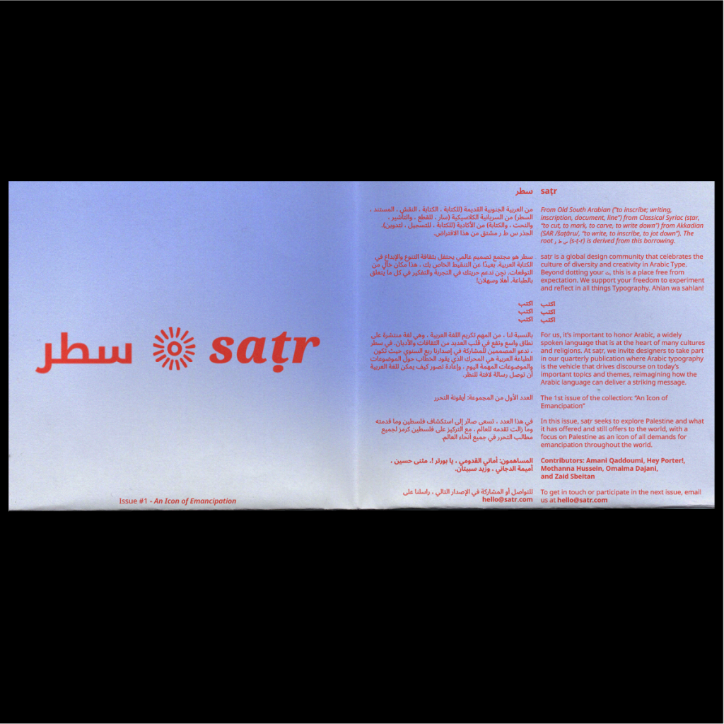
saṭr
From Old South Arabian (“to inscribe; writing, inscription, document, line”) from Classical Syriac (sṭar, “to cut, to mark, to carve, to write down”) from Akkadian (SAR /šaṭāru/, “to write, to inscribe, to jot down”). The root س ط ر (s-ṭ-r) is derived from this borrowing.
saṭr is a global design community that celebrates the culture of diversity and creativity in Arabic Type. Beyond dotting your ت, this is a place free from expectation. We support your freedom to experiment and reflect on all things Typography. Ahlan wa sahlan!
اكتب
اكتب
اكتب
For us, it’s important to honor Arabic, a widely spoken language that is at the heart of many cultures and religions. At saṭr, we invite designers to take part in our quarterly publication where Arabic typography is the vehicle that drives discourse on today’s important topics and themes, reimagining how the Arabic language can deliver a striking message.
The 1st issue of the collection: “An Icon of Emancipation”
In this issue, saṭr seeks to explore Palestine and what it has offered and still offers to the world, with a focus on Palestine as an icon of all demands for emancipation throughout the world.
Contributors: Amani Qaddoumi, Hey Porter!, Mothanna Hussein, Omaima Dajani, and Zaid Sbeitan
To get in touch or participate in the next issue, email us at hello@satr.com
سطر
من العربية الجنوبية القديمة (للكتابة ، الكتابة ، النقش ، المستند ، السطر) من السريانية الكلاسيكية (سار ، للقطع ، والتأشير ، والنحت ، والكتابة) من الأكادية (للكتابة ، للتسجيل ، لتدوين). الجذر س ط ر مشتق من هذا الاقتراض.
سطر هو مجتمع تصميم عالمي يحتفل بثقافة التنوع والإبداع في الكتابة العربية. بعيدًا عن التنقيط الخاص بك ، هذا مكان خالٍ من التوقعات. نحن ندعم حريتك في التجربة والتفكير في كل ما يتعلق بالطباعة. أهلًا وسهلان!
اكتب
اكتب
اكتب
بالنسبة لنا ، من المهم تكريم اللغة العربية ، وهي لغة منتشرة على نطاق واسع وتقع في قلب العديد من الثقافات والأديان. في سطر ، ندعو المصممين للمشاركة في إصدارنا ربع السنوي حيث تكون الطباعة العربية هي المحرك الذي يقود الخطاب حول الموضوعات والموضوعات المهمة اليوم ، وإعادة تصور كيف يمكن للغة العربية أن توصل رسالة لافتة للنظر.
العدد الأول من المجموعة: أيقونة التحرر
في هذا العدد ، تسعى صائر إلى استكشاف فلسطين وما قدمته وما زالت تقدمه للعالم ، مع التركيز على فلسطين كرمز لجميع مطالب التحرر في جميع أنحاء العالم.
المساهمون: أماني القدومي ، يا بورتر !، مثنى حسين ، أميمة الدجاني ، وزيد سبيتان.
للتواصل أو المشاركة في الإصدار التالي ، راسلنا على hello@satr.com
Publication Format
For this project, I want to experiment with publication formats. I had the idea of keeping the print as simple and cost-effective as possible so that the project is sustainable. One of the ideas was to have a fold-out poster, which housed each “page” on a square:
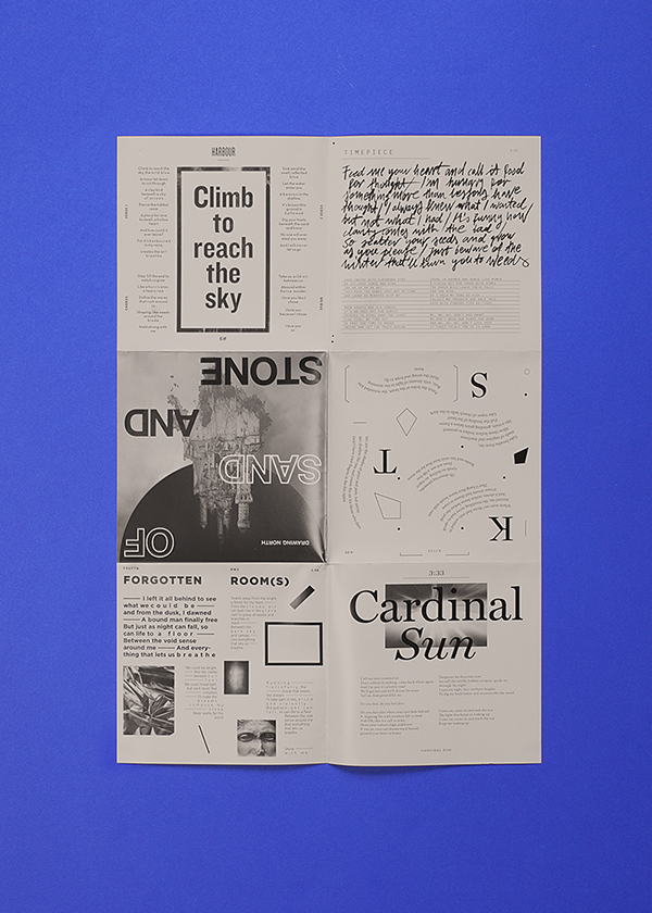
I like the look of all the separate pieces together on one side, including the cover, statement, and introduction. The other side can feature a main piece, almost like an artwork that could potentially be framed.

Another interesting format I came across is this “Saree” zine, which unfolded like one:
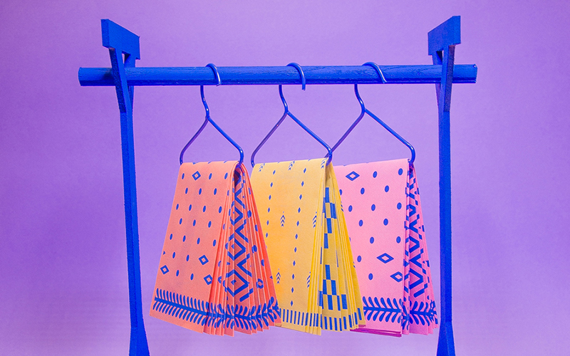
The beautiful print featured a pattern on one side and its content on the other:

It’s a beautiful visual representation of the cultural discourse it touches on inside the ‘zine.

For this project, I’ll keep it a bit basic and go with the format we all know and love from CD foldouts (shown above).
To prepare for the design, I worked backward, with the mockup in mind. Because I won’t be able to print any potential design out in the short period of time that I have, I wanted to see if I can recreate the idea digitally, but still make it look realistic. I folded an A4 sheet of paper into 6 equal (almost) squares, similar to a CD foldout.
The remainder of the design was straightforward. A simple “branding” of the project was already made last year when I first started conceptualizing it, so I simply copied that color pattern and logo to the poster layout.

The back has reversed colors and is reserved for the “flashiest piece”. I ended up choosing 5 different Palestinian-themed typography pieces from designers that I follow to illustrate how this project could possibly work. Of course, in reality, I would commission designers to create original pieces specifically for the issue, rather than collect or curate already existing works.

I tweaked the colors a bit more and added a third shot, which is the poster when it’s folded to only feature this week’s challenge, or basically just the title and description of this issue. It was important for me to place the English at equal weight to the Arabic, as the project does emphasize the importance of the latter.
The final result: a foldable poster zine that outlines to viewers and potential participants what the project is about, while also being a sought-after collector’s piece that could possibly contribute to the larger archive of Arabic typography.
Reference list
Toomes, P. (2022). Types of tone of voice: The ultimate guide – @GatherContent. [online] GatherContent. Available at: https://gathercontent.com/blog/the-ultimate-guide-to-tone-of-voice.
